Thanksgiving Colors: The Five-Color Palette and How to Mix It
November 5, 2026
Key Takeaways
- The five colors that carry Thanksgiving are burnt orange, russet brown, deep gold, cranberry red, and cream, and no organization designates them officially.
- Four of those five hues sit inside the red through yellow arc of the color wheel, so they differ only in value, which is why a correct Thanksgiving palette still looks muddy on paper.
- A basic twelve pencil set contains none of these by name, so you build burnt orange, russet, cranberry, and gold by layering the red, orange, yellow, brown, and violet it does contain.
- Give the darkest color the smallest area, because the tooth of 20 lb printer paper fills after three to five layers and deep cranberry across a whole pumpkin goes patchy and dented.
Who this is for: Parents, teachers, and colorists working a Thanksgiving or fall page with an ordinary pencil set.
Search for Thanksgiving colors and you get hex codes, a strip of numbered rectangles on nearly every result. A hex code is an instruction for a screen, and a wax pencil cannot execute it. So here is the palette as pigment: the five colors the holiday runs on, how to mix each from a basic set, and why a correct palette still turns to mud on paper. The history at the end is shorter and stranger than the decorating blogs suggest.
The five colors of Thanksgiving
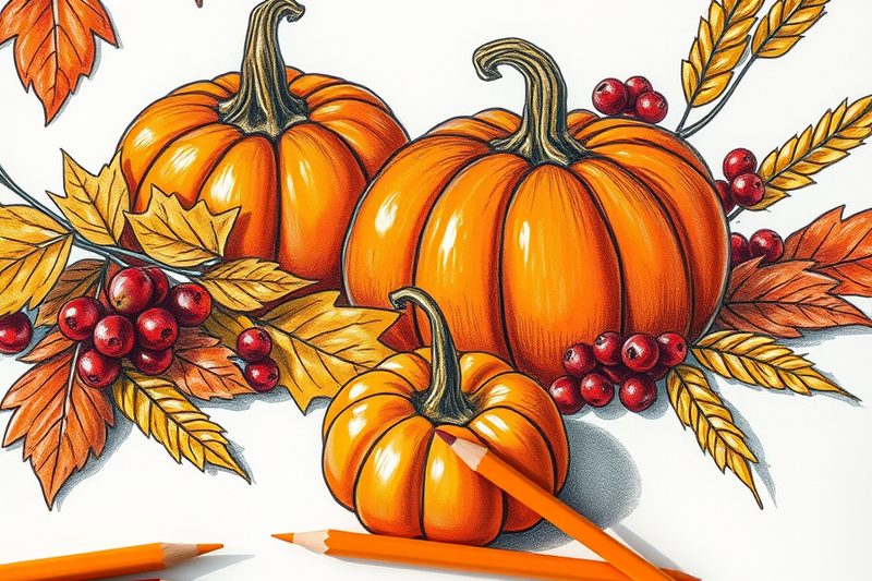
Burnt orange anchors the set: orange pulled toward red and dulled with brown, covering pumpkins, squash, and the warmest maple leaves. Pure orange out of the tin is too acidic and reads as Halloween.
Russet brown is the workhorse: oak leaves, bare branches, roast skin, wooden tables, cornucopias. It is brown with visible red in it, not the flat mud brown most sets supply.
Deep gold covers wheat, dried corn, and candlelight. It is yellow with its brightness taken down, which is not the same as yellow mixed with brown.
Cranberry red is the only cool note: red shifted toward purple, for berries, wine, and the deepest shadows.
Cream is the one people forget, because on a printable it is free. Linen, candles, pie crust, and tablecloth whites are paper you chose not to color.
No standards body, church calendar, or act of Congress names a Thanksgiving color, unlike Christmas, where the liturgical calendar does specify violet, rose, white, and gold. This palette is a decorating convention, not a tradition.
Why the Thanksgiving palette turns muddy on paper
This is what the hex strips hide. Burnt orange, russet, gold, and cranberry all fall inside roughly a quarter turn of the color wheel, from red around to yellow. That makes them an analogous palette, and analogous palettes have almost no hue contrast by definition. Christmas red and green sit opposite each other; Halloween orange on black is near the highest value contrast available. Thanksgiving has neither.
On a swatch strip this never surfaces, because a white gutter separates every rectangle from its neighbor. The gutter is doing the work. A coloring page has none. Two regions share a printed line about a point wide, and when the colors either side sit at the same lightness, your eye merges them into one shape.
So sort by value, not hue. Bare paper and cream are your lights, burnt orange and gold your mids, russet and cranberry your darks. Alternate them so no two touching regions share a band, and the shapes separate even though every color is warm. To check, photograph the page and switch it to black and white. If the pumpkin and the leaf behind it dissolve into one grey blob, the problem is value, not your choice of orange.
Then there is area. The tooth of 20 lb copy paper fills after about three to five layers, and the darkest colors need the most. Spread cranberry across a whole pumpkin and you run out of tooth, leave a patchy finish, and dent the sheet. Give the darks the small shapes: berries, stems, seams, shadow edges, the gaps between leaves, and let paper and mids carry everything large. For deep color over big areas, print on 65 lb to 110 lb cardstock, covered in our guide to printer paper for coloring pages.
Mix the whole palette from a basic set
A standard twelve pencil set holds red, orange, yellow, green, blue, violet, brown, black, white, and a few pastels. None of them is burnt orange, russet, cranberry, or gold. Every Thanksgiving color is a mix, which makes this the one holiday palette you cannot just select.
Burnt orange: orange first, then brown passed lightly over the shadow side only. Keep brown off the lit areas or the shape dulls.
Russet: orange underneath, brown on top, a trace of blue in the darkest part. Blue and orange are complements and neutralize into a deep natural brown, the route described in what colors make brown.
Cranberry: red at full pressure, violet in the darks, a whisper of brown at the edges. Violet moves red away from fire engine and toward fruit.
Deep gold: yellow with a light pass of brown, or a trace of violet, which dulls it without browning it. Full version in what colors make gold.
Cream: leave the paper alone, or give it one pass of yellow at the lightest pressure you can hold. Skip the white pencil: it adds wax without lightness and clogs the tooth so nothing layers over it.
Build these in three to five light passes rather than one heavy one, the argument made in how to blend colored pencils. A pumpkin page is the best practice ground: one pumpkin needs burnt orange, russet, and cream within a few inches.
Where the palette actually came from
Not from 1621. The only eyewitness account of the Plymouth harvest is a letter by Edward Winslow, published in 1622 in Mourt's Relation, and it names two foods: wildfowl, and five deer brought by the Wampanoag guests. It says nothing about cranberry sauce, pumpkin pie, or an orange and brown table, and the colonists had no ovens, wheat flour, or butter for pastry.
The date arrived later. Sarah Josepha Hale, editor of Godey's Lady's Book, campaigned from 1846 for a fixed national day of thanks. Lincoln proclaimed it in 1863, setting the last Thursday in November, and Congress moved it to the fourth Thursday in a law Roosevelt signed in 1941.
The palette is the color of that date. A holiday pinned to late November in the northern United States inherits what is outside the window: oak and maple past peak, harvested corn, bare wood, the last berries. Twentieth century decorating and greeting cards standardized it, which is why nobody can name an official shade. Our fall collection and forest pages work the same late season range.
Frequently Asked Questions
What colors do you wear for Thanksgiving?
Deep earth and jewel tones: rust, camel, olive, burgundy, forest green, and cream. There is no rule, but two notes hold up. Skip pale pastels and pure white at a table serving gravy and cranberry sauce, and avoid matching the tablecloth so you still separate from the background in photographs. Wardrobe and pigment are different problems: a rust sweater is one dye, rust on paper is three layers.
Are Thanksgiving colors the same as fall colors?
No. Fall covers the full foliage range, including bright scarlet maple, chartreuse, and clear yellow. Thanksgiving uses the darker, browner end of that range, adds cranberry, and drops the bright greens almost entirely. The difference is practical: a fall scene carries pure yellow at full strength, while the same yellow in a Thanksgiving table scene reads as spring unless you dull it toward gold first.
What colors are real turkey feathers?
Bronze, copper, and green, not plain brown. A wild turkey's body feathers carry an iridescent bronze and green sheen that looks near black from a distance, and the flight feathers are barred black and white. The bare skin of the head and neck shifts between red, white, and blue with the bird's excitement, and males carry a red wattle and snood. Domestic Broad Breasted Whites are solid white.
Where can I get free printable Thanksgiving coloring pages?
ColoringDen's Thanksgiving collection is free and printable, downloads as an instant PDF, and needs no sign-up and no account. Turkeys, harvest tables, and cornucopias sit there, and the farm animal pages add more birds for practicing bronze plumage. Print on ordinary 20 lb copy paper for pencils, and step up to 65 lb cardstock only if you are working in markers.
Start coloring
Five warm colors you mix rather than pick, arranged by value rather than hue, with the darkest kept to the smallest shapes. Get those three right and a basic set beats an expensive one used carelessly.
Now pick a page. Every ColoringDen page is free, printable, and downloads as an instant PDF with no account, so a failed experiment costs one reprint. Start with Thanksgiving, move to fall for leaves and acorns, then pumpkins to drill burnt orange alone.