Christmas Colors: The Traditional Palette and How to Mix It
November 3, 2026
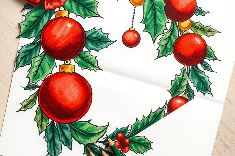
Key Takeaways
- The traditional Christmas palette is six colors: red, green, gold, silver, white, and a deep plum or burgundy accent that carries the shadows.
- Red and green sit opposite each other on the artists' color wheel, so wherever they touch they mix into brown. Keep one color in every adjacent pair light in value and the pair stays clean.
- Cambridge art historian Spike Bucklow traced the red and green pairing to the painted rood screens of 15th and 16th century English churches, which Victorian restorers rediscovered and made fashionable again.
- Coca-Cola did not invent the red Santa suit. Thomas Nast drew a red-suited Santa for Harper's Weekly in 1881, fifty years before Haddon Sundblom's 1931 Coca-Cola campaign made the look global.
Who this is for: Parents, teachers, and adult colorists choosing colors for Christmas coloring pages.
Search for Christmas colors and you get six hex codes. That is fine for a web banner and useless if you are holding a tin of colored pencils, because a code like #C8102E is a screen instruction. This guide gives the Christmas palette as pigment instead. You will learn which six colors the tradition contains, where red and green came from, why they fight each other on paper, and four palettes that hold up on a sheet you printed at home.
The six colors of the Christmas palette
Red is the anchor and comes in two temperatures. Warm scarlet suits Santa's coat and holly berries; cooler crimson suits velvet ribbon and bows. Most sets give you one red between the two, so push it warm with a pass of orange or cool with a trace of magenta.
Green is where beginners lose the holiday look. The green straight out of a 24 pencil set is a bright yellow-green that reads as spring grass, not conifer. Fir and pine need a dark, cool green, which means adding blue. Holly leaves need a mid green with a slight blue cast and a glossy highlight left bare. See mixing green for the ratios.
Gold is not yellow. Yellow is bright and flat, while gold reads as metal only once its brightness is knocked down with brown or a trace of purple. That one adjustment is the difference between a gold bauble and a lemon. See mixing gold.
Silver is grey with a cool blue cast, and it only looks metallic if you leave hard white highlights unshaded. Flat grey looks like pencil. See what colors make silver.
White behaves differently on a printable than in any other medium: white is the paper. You do not apply it, you protect it. Snow, fur trim, and metal highlights all work by planning which shapes to leave untouched before you start.
Deep plum or burgundy is the sixth color and the one most palettes skip. It does the work black ruins: shading inside a red shape without turning it grey, and darkening green foliage without deadening it. Mixing maroon gives the recipe.
Why red and green became Christmas colors
Midwinter greenery came first. Holly, ivy, and evergreen boughs were brought indoors in European winter decoration long before they were Christmas decorations, and holly arrives with its own two-color scheme attached: dark glossy leaves and bright red berries.
The pairing became a convention through paint. Cambridge art historian Spike Bucklow found that red and green were used heavily on the carved rood screens that divided the nave from the chancel in 15th and 16th century English churches. Victorian restorers noticed the combination and carried it into the Christmas aesthetic they were busy inventing. Bucklow's reading is that red and green marked a boundary, which is what a rood screen is for.
Red and green are not the church's Christmas colors. In liturgical use, Advent is violet, the third Sunday of Advent may be rose, and Christmas Day itself is white, with gold permitted on the most festive days. The ecclesiastical palette for a nativity page is violet, rose, white, and gold.
Coca-Cola gets undeserved credit. Haddon Sundblom's Coca-Cola Santa began in 1931 and made the red suit a global standard, but Thomas Nast had already drawn one for Harper's Weekly in 1881. The red came decades before the soda. The poinsettia is a genuine addition, named for Joel Roberts Poinsett, the American minister to Mexico who brought the plant to the United States.
Why red and green fight each other on paper
Red and green are near-complements. That is what makes them festive together and why they are the hardest Christmas pair to color cleanly. Two things go wrong.
The first is mixing. Complements neutralize each other, so red over green makes brown or a muddy grey, as our guide to red explains. On a coloring page, a holly leaf and a berry are often separated by nothing but a printed line half a millimeter wide. Stray over it in either direction and you get a brown fringe.
The second is vibration. Two saturated complements of similar darkness, pressed together, make the shared edge shimmer. It is why a page in full-strength red and green looks loud rather than rich.
Both problems have the same fix: vary value, not just hue. In every adjacent pair, keep one side light. A pale warm red against a deep fir green reads as expensive; full red against full green reads as a discount banner. The easiest light value is the paper itself, which never muddies.
Paper weight matters too. Standard printer paper is 20 lb while cardstock runs 65 lb to 110 lb, and 20 lb gives you fewer layers before the tooth fills and pigment stops taking. Build deep green in three or four light passes, not one heavy one. For more layering room, see our printer paper guide.
Four Christmas palettes that work on a printable
Traditional. Scarlet red, deep fir green, gold, and bare paper for the white. The safest choice for Christmas coloring pages with wreaths, stockings, and trees. Keep gold to small shapes so it stays an accent.
Frosted Scandinavian. Ice blue, silver grey, white paper, and exactly one red accent per page. It rescues a page with large empty areas, because pale blues and greys keep big shapes from going heavy. Good for winter coloring pages and snowflakes.
Victorian jewel. Burgundy, deep emerald, antique gold, and plum. The darkest of the four and the best match for dense adult pages, where a narrow value range suits intricate line work.
Candy. Cherry red, mint green, bright gold, and pink. Forgiving of crayons, which makes it the right pick for young children and for gingerbread pages. Every page linked here downloads free as a printable PDF with no sign-up and no account, so testing a palette costs one sheet of paper.
Frequently Asked Questions
What are the 12 Christmas colors?
There is no official list of 12. The phrase comes from palette roundups, not from any tradition or standards body. The nearest thing to an authorized set is liturgical: violet for Advent, rose for the third Sunday of Advent, and white or gold for Christmas Day. A practical extended palette runs to about ten: red, green, gold, silver, white, burgundy, plum, ice blue, copper, and pink.
Is yellow a Christmas color?
Not on its own, but gold is, and gold is yellow with its brightness removed. A pure yellow next to Christmas red and green reads as spring or as a cartoon. Mix a little brown or a trace of purple into your yellow and the same pencil becomes the metallic gold the palette wants. Yellow does work undiluted for one thing: candle and lantern flames.
What are the Christmas colors for 2026?
No organization designates an official Christmas color for a given year. Pantone's Color of the Year is a general design forecast, not a holiday scheme, and the 2026 shades being promoted come from decorators and retailers choosing a theme. The traditional palette has been stable for more than a century, so red, green, and gold will not look dated.
What are the Christmas color hex codes?
There is no standard set, but the widely used approximations are roughly #C8102E for holiday red, #15502E for fir green, #D4AF37 for gold, and #C0C0C0 for silver. Those codes describe light on a screen and cannot be reproduced by a pencil or crayon, which mixes pigment instead. Use them for digital work, layered pigment on paper.
Start Coloring
The Christmas palette is six colors, not six hex codes, and the habit that improves a holiday page most is keeping one side of every red and green pair light. Pick a palette above, protect your whites before you start, and build dark greens in thin layers.
Browse Christmas coloring pages at coloringden.com to put a palette to work, or try winter pages and New Year pages for the rest of the season. Every sheet is free and printable, needs no sign-up, and downloads instantly as a PDF. For the autumn equivalent, our Halloween colors guide covers that palette the same way.