What Colors Make Silver? How to Mix Silver for Coloring Pages
October 9, 2026
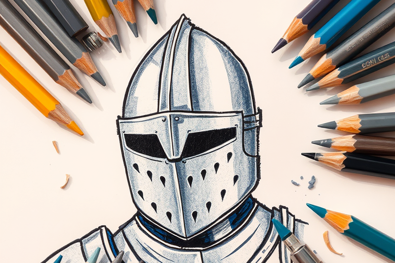
Key Takeaways
- Silver is a brightness pattern rather than a hue, so build it from a neutral gray shifted cool with one touch of blue.
- The standard silver swatch is a light gray: #C0C0C0, or rgb(192, 192, 192), which sits 75 percent of the way from black toward white.
- Metal reads as metal because of contrast, not color, so leave one hard white highlight uncolored and step through light gray, mid gray, and near black in four distinct bands.
- Metallic silver gel pens sit on top of the sheet instead of soaking in, so they hold their shine on 65 lb to 110 lb cardstock and smear on 20 lb printer paper.
Who this is for: Kids, parents, and adult colorists who want armor, robots, swords, and chrome to look like real metal on a printed page.
Ask a box of 24 pencils for silver and you will not find it. There is gray, maybe two grays, and that is the whole metal section. So most colorists fill the knight's breastplate with flat gray and end up with a knight wearing concrete. The fix is not a better gray. Silver is not really a color at all, it is a pattern of bright and dark that your eye reads as a shiny surface. Here is the gray mix, the four bands that turn gray into metal, where the highlight goes, and which tools hold a real shine.
The Silver Mix: Gray First, Then One Touch of Blue
Silver starts as a neutral gray from white and black, mixed in that direction: begin with white and add black a speck at a time. Black pigment tints far more strongly than white, and one heavy stroke takes you past gray into charcoal.
Target a light gray, not a middle one. The standard silver swatch is #C0C0C0, one of the sixteen original named colors in HTML and CSS. Plain gray in that list is #808080, a full step darker. People mix silver too dark almost every time, and a dark base leaves no room for shadows later.
Now make it read as silver instead of pavement. Add the smallest amount of light blue you can manage, because polished metal reflects whatever surrounds it and in most scenes that is the sky. Payne's gray, invented by the English painter William Payne in the late 1700s, is a blue leaning gray built from ultramarine and black, and it remains the standard choice for armor and steel. In colored pencil, layer instead of mix: light gray, pale blue at gentle pressure, then light gray again.
Why Flat Gray Looks Like Stone and Four Bands Look Like Metal
A shiny surface bounces light back in a narrow beam instead of scattering it. On paper that becomes one rule: silver needs a short distance between its brightest and darkest point. Stone fades gradually. Metal jumps.
So color every silver shape in four bands:
- The highlight. Leave it as bare white paper, no wider than a thin sliver. Paper white is the brightest white you own.
- The light band. Your #C0C0C0 silver gray, sitting right against the highlight.
- The mid band. The same gray with a second layer, or one step darker in your set.
- The dark band. Near black, pushed into the deepest crease or the edge furthest from the light. Keep it narrow.
Then stop. A smooth ramp makes armor look like felt, so keep the highlight boundary crisp and soften only the join between the mid and dark bands. One last trick: add a thin dark line along the bottom edge and a thin light line along the top. Metal almost always has a visible rim, and that pair sells the material faster than anything else.
Where the Highlight Goes on Curves Versus Flats
On a curve like a helmet, a car fender, or a robot's dome head, the highlight runs as a long stripe following the curve. Place it off center, about a third of the way in from the lit side, never dead middle. One stripe per curve, because two read as plastic.
On a flat like a sword blade, a key, or a chest plate, the highlight becomes a hard wedge with straight edges, because a flat mirror reflects a clean shape rather than a smear. On a blade, run a bright strip down one side of the center line and a darker strip down the other. That asymmetry is what makes a blade look sharpened. Rivets and chain links are smaller than the bands can handle, so anything narrower than your pencil tip gets left white or filled dark.
What Each Tool Actually Does With Silver
Colored pencils are the most forgiving. Three to five light layers hold more pigment and blend more evenly than one heavy press, and light pressure keeps the paper's tooth open for the next layer. Binder matters too: Prismacolor Premier pencils use a soft wax binder that blends easily, while Faber-Castell Polychromos use an oil binder that holds a crisper edge when you want a hard highlight boundary to stay hard. Markers cannot leave a highlight behind, so color the three gray bands and work around that shape.
Metallic silver gel pens, such as Sakura's Gelly Roll Metallic line, are the only tools that produce a real physical shine, because their reflective particles sit on the paper surface instead of soaking into the fibers. That is also their weakness: on 20 lb printer paper the ink stays wet long enough to smear and the sheet buckles. Print on 65 lb to 110 lb cardstock, and use them last as an accent over finished pencil work, never as the base layer.
Pages Worth Practicing Silver On
Start with large smooth shapes before you attempt chain mail. Knight coloring pages are the best entry point, because a breastplate is one big curve and a sword is one big flat, so you get both lessons on one sheet. Robot coloring pages give you boxy plating where the geometric highlight does all the work. Car coloring pages are the curve drill: fenders, bumpers, and wheel rims, every one reflecting a sky you can suggest with that touch of blue. When the four bands feel automatic, move to dragon coloring pages, where overlapping scales want a sheen on the top edge of each one, or winter coloring pages, where snowflakes and icicles put silver and white side by side.
Every page linked above downloads free as a printable PDF with no sign-up and no account, so you can print the same knight five times and try a different highlight on each. That repetition, not a better pencil, is what fixes silver.
Frequently Asked Questions
Is silver a color?
Silver is not a hue, it is a lightness with a reflective quality attached. It does not appear on a color wheel, because a wheel plots hue and silver's defining feature is shine. In practice it is treated as a color anyway: silver is one of the sixteen original named colors in HTML and CSS, defined as the light gray #C0C0C0.
What color goes with silver?
Navy, black, charcoal, white, teal, and deep purple all pair cleanly with silver, because silver is a cool neutral and sits best against cool or dark companions. On a coloring page, a navy or deep purple background behind a silver subject gives the strongest separation. Avoid a mid gray background, which flattens subject and background into one tone.
What color does silver and gold make?
Layering silver gray over gold produces a dull, muddy warm gray rather than a new metal, because you are mixing a cool neutral into a warm yellow brown and canceling both. Keep them in separate shapes. If a crown needs both metals, color the band gold and the rivets silver, and leave a clean line of untouched paper between them.
What is another name for the color silver?
Pewter, platinum, gunmetal, chrome, and steel are the common names for silver variants, and each carries a different value. Pewter and gunmetal run darker and duller, platinum and chrome run lighter and brighter. In a pencil set, look for slate gray, which is #708090 in CSS, or Payne's gray. Both are blue leaning grays that work as a silver base with no mixing.
Start With One Breastplate
Silver is less about finding the right gray and more about committing to contrast. Mix a light gray from white plus a speck of black, cool it with a touch of blue, leave the highlight as bare paper, and hold four clear bands instead of one blend. Do that once on a knight's breastplate and it transfers to every robot, car, sword, and snowflake you color afterward.
Browse coloringden.com and print a page to practice on. Every sheet is free, printable, and downloads as an instant PDF with no sign-up, so the only cost is ink.