What Colors Make Maroon? How to Mix Maroon for Coloring Pages
October 13, 2026
Key Takeaways
- Maroon is red darkened, not red mixed with a second hue. Its color code is #800000, which is RGB 128, 0, 0: pure red with the brightness turned down by half and zero green and zero blue in it.
- Start at roughly four parts red to one part black and add the black a trace at a time, because black is the stronger pigment and one heavy touch turns maroon into charcoal.
- A pinpoint of green darkens red more cleanly than black does, because green sits directly opposite red on the color wheel and drains brightness without laying grey over the color.
- Maroon and burgundy are not the same color. Maroon is #800000 at hue 0, while burgundy is commonly given as #800020 at hue 345, which puts 15 degrees of purple into it.
Who this is for: Kids, parents, and adult colorists mixing maroon for autumn leaves, roses, brick, velvet, and school colors with pencils, markers, or crayons.
Maroon is the color most people reach for in October and most people get wrong. The usual attempt is red plus black, and the usual result is a flat brick that looks dusty instead of deep. The problem is rarely the recipe. It is the amount. Maroon sits only a quarter of the way up the brightness scale, so it takes very little darkening agent and a great deal of restraint. This guide covers the ratio to start from, why green beats black, how the mix changes across pencils, markers, and crayons, and how to push maroon warmer, cooler, or deeper.
What Two Colors Make Maroon
Maroon is red and black, at roughly four parts red to one part black. Add the black in traces rather than in dollops, because black pigment is far more powerful than red and the gap between maroon and mud is about one extra stroke.
The color code explains why the ratio has to be lopsided. Maroon is #800000, which is RGB 128, 0, 0, or HSL 0 degrees, 100 percent, 25 percent. Read those three numbers in order. The hue is 0, exactly pure red, so maroon involves no shift toward orange or purple at all. The saturation is 100 percent, so maroon is a fully intense color rather than a greyed one. The lightness is 25 percent, half of the 50 percent that pure red sits at. Maroon is red with the lights dimmed and nothing else done to it, which is why any ingredient that changes the hue takes you further from it rather than closer.
That is the trap in red plus black. Black kills saturation as it darkens, so most black pencils and paints pull the mix toward grey long before they get it down to 25 percent lightness.
The cleaner darkener is green. Red and green sit opposite each other on the artists' color wheel, and a complement takes brightness out of a color without laying grey over it. Add green in amounts you can barely see, because a complement that goes past the balance point flips the mix to brown.
Your choice of red matters more than either darkener. A cool, blue leaning red like alizarin crimson is already partway to maroon, while a warm, orange leaning red like cadmium red travels through brick and usually arrives brown.
How to Mix Maroon With Pencils, Markers, and Crayons
Maroon is a dark color, and every medium runs out of darkening range at a different point.
Colored pencils: build value in layers, never in pressure. Pigment sits in a binder that fills the tooth of the paper, and once the tooth is full the surface goes slick and refuses the next color. Lay three or four light passes of a crimson or scarlet pencil, then glaze a dark red or an indigo over the top until the value drops. Binder type sets your layer budget: Prismacolor Premier pencils use a wax binder, which fills the tooth in fewer passes, while Faber-Castell Polychromos use an oil binder and accept more layers before slicking over. Both lines also sell maroon as a single pencil, so you can skip the mix entirely. Prismacolor PC937 Tuscan Red runs about 1.35 to 2.49 dollars on its own.
Markers: there is no black marker shortcut. Marker ink is transparent dye, so layering black over red does not darken the red, it floods it. Put down your mid red across the whole shape, then lay a second and third pass of the same marker into the areas that need depth while the ink is still wet. Each wet pass stacks dye and drops the value a step. Finish the darkest notes with a wine marker rather than black. Markers also bleed through standard 20 lb printer paper, so slide a scrap sheet underneath or print on cardstock, which runs 65 lb to 110 lb.
Crayons: red first, a whisper of black, then burnish. Lay red at medium pressure over the whole shape, then stroke black very lightly with the side of the tip at a shallow angle so it catches only the high points of the paper. Make a third pass with red on top to melt the two together. Wax resists layering, so heavy pressure on the black locks it in as a grey smear no red will cover.
How to Shift Maroon Warmer, Cooler, and Deeper
Maroon is a family rather than a single swatch, and four adjustments cover nearly everything you will need from it.
To go warmer, toward rust, brick, and dried oak leaves, add a pass of burnt sienna or a light glaze of orange.
To go cooler, toward wine, plum, and velvet, add a trace of violet. This is the move that walks maroon toward burgundy, so stop as soon as the purple becomes visible.
To go deeper, toward shadow and the inside of a rose, add indigo rather than black. Indigo is dark enough to drop the value and blue enough to keep the color alive, while black flattens the area into a hole.
To go lighter, press softer and let more paper show through instead of adding white on top. White pencil over maroon produces a chalky pink bloom, not a lighter maroon.
Test each of these in the white margin before you commit it. Two light passes in the border cost nothing.
Pages Worth Practicing Maroon On
Maroon shows its quality on large shapes, because a muddy maroon is invisible in a tiny petal and obvious across a whole leaf.
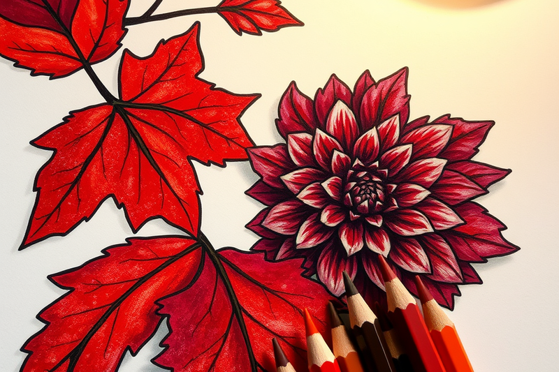
Start with fall coloring pages, which are close to a perfect drill: oak and maple leaves want three maroons at once, a warm rusty one in the light, a mid tone across the body, and a deep cool one in the shadow. Flower pages teach the opposite skill, holding one consistent maroon across dozens of small petals without streaking, and a deep red dahlia is almost exactly #800000. Thanksgiving pages set maroon against orange and gold, which is the hardest test of whether your mix went brown. Stained glass pages ask for one flat even maroon inside hard black borders, and floral pattern pages let you repeat the mix until it is automatic. Every page linked here downloads free as a printable PDF with no sign-up and no account.
Frequently Asked Questions
What colors make maroon without red?
You cannot make a true maroon without red, because maroon sits at hue 0, which is the exact definition of red. The closest workaround is purple plus orange, which gives a dull red brown, or purple plus brown, which lands a little cooler. Both read as maroon at a glance, but neither holds the 100 percent saturation that makes real maroon look rich rather than dusty.
What is the difference between maroon and burgundy?
Maroon leans brown and burgundy leans purple. Maroon is a fixed CSS named color at #800000, hue 0, with nothing but red in it. Burgundy is not a CSS named color at all and is most often given as #800020, which carries a blue value of 32 and sits at hue 345, about 15 degrees around the wheel toward purple. Practically speaking, add violet to maroon and you get burgundy.
What colors go with maroon?
Gold, cream, forest green, navy, and dusty pink all pair well with maroon. Gold and cream work because they are light and warm, so they give a dark warm color somewhere to breathe. Forest green works because it is maroon's near complement, which is the strongest contrast available. Avoid pairing maroon with pure black, which sits so close in value that it erases the difference between them.
Is maroon a shade of red or purple?
Maroon is a shade of red, not purple. The hue value settles it: maroon is hue 0, which is pure red, while purple does not begin until roughly 270 degrees around the wheel. The confusion comes from everyday speech, where people use maroon and burgundy interchangeably, and burgundy genuinely does lean purple at hue 345. Maroon itself is red at 25 percent lightness.
Start Mixing
Maroon comes down to one correction. Stop piling on black until the color looks dark enough and start adding it one trace at a time, because the color code says 100 percent saturation and black is the fastest way to lose it. Choose a cool red, darken it with a pinpoint of green or a glaze of indigo, and keep the ratio near four to one. That sequence gives you autumn leaves, roses, wine, and brick from one starting mix.
The fastest way to lock it in is to run the mix across something large enough to show your mistakes. Browse the full library at coloringden.com and print a page with a big red shape on it. Every page is free, printable, and downloads instantly as a PDF with no sign-up required.