What Colors Make Gray? How to Mix Gray for Coloring Pages
September 29, 2026
Key Takeaways
- Black and white do make gray, but that gray is flat, and mixing two complementary colors instead gives a gray with visible temperature and depth.
- Any two colors opposite on the color wheel neutralize into gray at roughly equal strength: blue with orange, yellow with purple, red with green.
- Warm gray leans brown and cool gray leans blue, which is why Prismacolor sells Warm Grey, Cool Grey, and French Grey as separate lines in percentage steps from 10% to 90%.
- Build gray from three to five light colored pencil layers rather than one heavy pass of black, because heavy pressure crushes the paper tooth and blocks every layer added after it.
Who this is for: Colorists mixing gray with pencils, markers, or paint, and anyone coloring gray subjects like elephants, sharks, and stone castles.
Gray sounds like the easy one. Grab the black pencil, press lightly, done. Then the elephant comes out looking like a dirty thumbprint. Gray is one of the harder colors to get right, because a convincing gray is almost never neutral. It leans somewhere, and the lean is the whole point. This guide covers both ways to mix gray, why one of them looks dead on paper, how to steer gray warm or cool, and how to build it with the pencils you already own.
Black and White Make Gray, and That Is Exactly the Problem
Black plus white gives you gray. Nobody is lying to you about that. The trouble is what kind of gray you get.
Black pigment in a standard pencil or paint set is carbon based or a very dark blue black, and it carries almost no chroma of its own. Dilute it and the gray has almost no chroma either. Put that gray beside any saturated color on the same page and it stops reading as a color at all. It reads as a smudge.
Coloring pages add a second problem: you have no white pigment to mix with, because the white is the sheet. So "black plus white" really means pressing lightly with a black pencil, and light pressure is where black misbehaves. It goes patchy and catches every fiber in the paper.
Use a black and white gray when you want a dead neutral, such as machinery. For anything organic, mix your gray instead.
Mix Two Complements and Gray Comes Back to Life
Complementary colors sit opposite each other on the color wheel. Combine a pair at roughly equal strength and each cancels the other's saturation, leaving a gray that still remembers where it came from. Three pairs matter.
Blue and orange is the workhorse. It produces slate grays, storm cloud grays, and wet stone. Lay blue first, work orange over the areas you want to settle down, and stop the moment the blue stops reading as blue.
Yellow and purple gives warmer, dustier grays that lean slightly olive or putty. Reach for it on driftwood, weathered bone, and the tan gray of an animal's underbelly.
Red and green is the trickiest, because red pigment is usually far stronger than green. Add the green in small amounts or the mix slides past gray into brown and maroon.
If you only own red, yellow, and blue, you can still get there: all three primaries in roughly equal amounts land in the same neutral territory.
The method is the same every time. Start with whichever color you want the gray to lean toward, then add its complement in small steps until the color drops out. Stop one step before neutral. That last hint of color separates a gray that looks intentional from one that looks like an eraser accident.
Warm Gray or Cool Gray: Choose by What Sits Next to It
Every mixed gray has a temperature. Cool grays lean blue or violet, warm grays lean brown or red. Neither is more correct, and picking the wrong one is the most common reason a gray looks off in an otherwise good page.
The rule that works: gray takes its temperature from its light source and its neighbors. A shadow on a warm brown animal goes warm gray. A shadow on a snowy roof under open sky goes cool gray.
Pencil makers already split gray this way. Prismacolor Premier lists Warm Grey, Cool Grey, and French Grey as three separate families, each running in percentage steps from 10% to 90%, where the number is how dark the gray is rather than how warm. Copic markers use letter codes for the same idea: C for Cool Gray, W for Warm Gray, N for Neutral Gray, and T for Toner Gray, with the number giving the value.
Avoid mixing two gray families inside one object. A koala with cool gray shadows and warm gray midtones reads as muddy rather than as a koala in interesting light. Pick one family per subject and change only the value.
How to Build Gray With Pencils, Markers, and Graphite
Colored pencils. Do not start with black. Start with the local color of the object, put down three to five light layers, then introduce the complement to knock the saturation back. Save black for the deepest core shadow, if you use it at all. The reason for light layers is mechanical: paper has a tooth, that tooth holds the pigment, and one heavy pass flattens it. Once the tooth is gone, later layers slide off and the area goes waxy.
Markers. Gray marker families arrive pre mixed, so buy value steps rather than more hues. A second pass over dry ink deepens the value noticeably, which is why a three marker gray set covers more range than the swatches suggest. Work light to dark and let each pass dry, because wet ink streaks and blooms.
Graphite. A graphite pencil gives a cool gray with a faint metallic sheen, and the grade controls how dark it goes: a 2B lays a lighter gray than a 6B at the same pressure. Graphite smudges onto everything beside it, so lay it last.
Pages Where Gray Does the Real Work
Gray is easiest to learn on subjects that are mostly gray already, because you get a large field to work on without fighting neighboring colors.
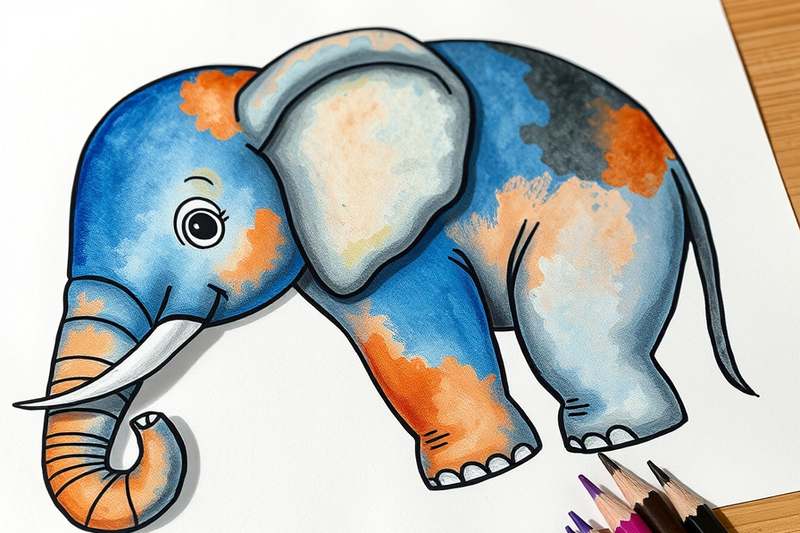
Elephant coloring pages give you the biggest gray surface on the site, and the folds in the hide map out where to go darker. Shark coloring pages ask for a cool blue gray on the back grading to near white on the belly, a value exercise more than a color one. Castle coloring pages break gray into hundreds of stones, so you can vary the temperature block by block. Koala coloring pages set a warm French gray coat against green eucalyptus, a good place to test the warm and cool rule. Space coloring pages hand you craters and rocket hulls, where a neutral black and white gray finally is the right answer.
Every page linked above downloads free as a printable PDF, with no sign up and no account.
Frequently Asked Questions
Do yellow and blue make gray?
No. Yellow and blue make green, because they sit near each other on the wheel rather than opposite. To gray down a yellow you need purple, its complement. To gray down a blue you need orange. If your yellow and blue mix comes out murky rather than green, one pigment is contaminated, usually a blue that leans green or a yellow that leans orange.
Do green and red make gray?
Yes. Red and green are complements, so combining them cancels saturation and lands in gray. In practice most red pigments overpower most green pigments, so the mix tends to slide into brown or maroon before it reaches neutral. Add green to red a little at a time rather than the reverse, and expect to need noticeably more green than red by volume.
What color does brown and gray make?
Brown and gray make greige, also called taupe, a muted warm neutral sitting between the two. It is one of the most useful colors on a coloring page and almost impossible to buy in a pencil set. Use it for tree bark, weathered fence wood, animal fur, and dirt. Warm gray plus a light brown gets you there faster than cool gray plus brown, which tends to go purple.
What color does green and gray make?
Green and gray make sage, a soft desaturated green. The gray pulls chroma out of the green without darkening it much, so sage stays light and calm. It is the right color for moss, eucalyptus leaves, and faded military green. Add gray to green in small increments, because sage tips into flat gray green quickly and there is no way back.
Start With One Gray Subject
The fastest way to stop mixing muddy grays is to pick one subject, commit to one temperature, and build it in light layers. Print an elephant, decide the light is warm, and mix every shadow from blue and orange rather than reaching for black. Do it once and the difference becomes impossible to unsee.
Browse the full collection at coloringden.com when you are ready to practice. Every page prints free with no sign up, and the PDF downloads instantly.